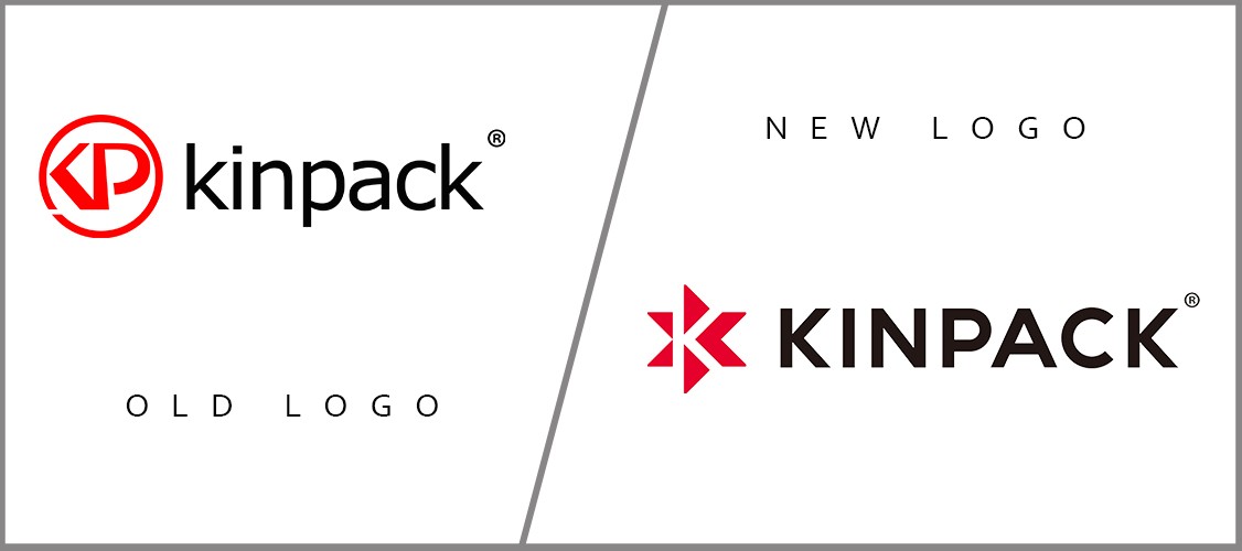
Start LOGO New In Order To BE Different
Our New Logo Consists of Three Parts
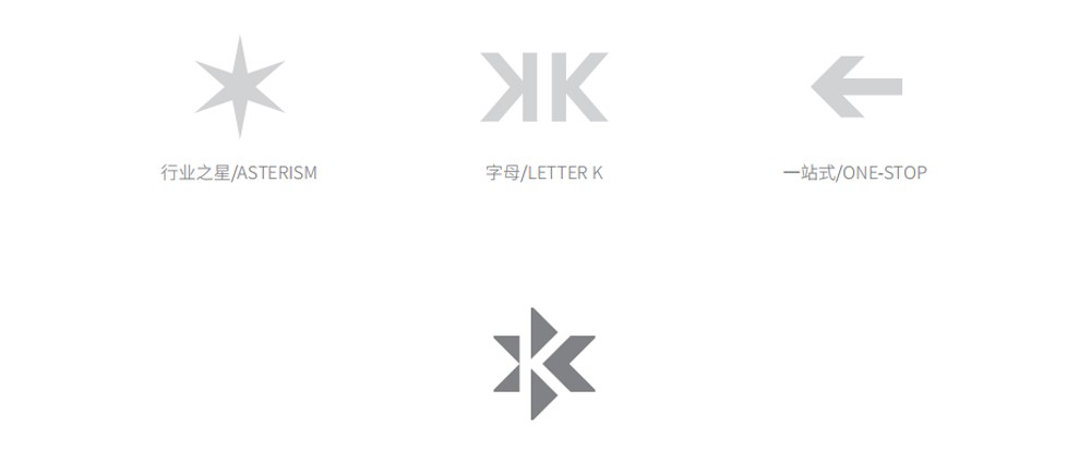
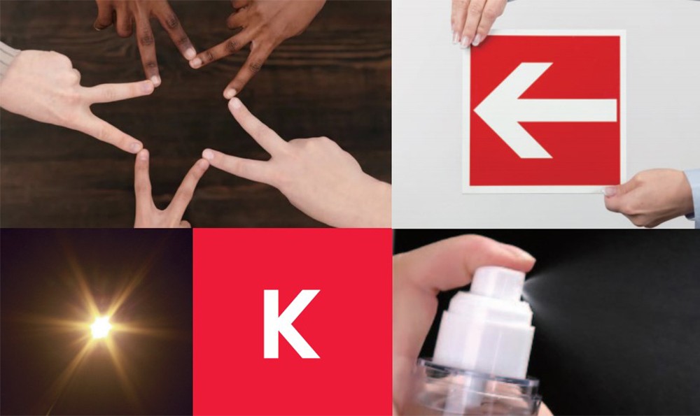
- We have chosen a part of the ASTERISM, which means we are small, but we are full of wisdom.
- We are KINPACK, so in the LOGO, our initial letter “K” is included, which means that we will always put KINPACK in the first place.
- We are committed to creating a one-stop service, which is our original intention. We also contain the symbol of the one-stop arrow in it, which means that we will not forget our original intention.
And you can find that we kept the original colors, the logo still consists of red LOGO and black letters. We want to tell our friends that we are still us, but we are constantly improving, hoping to bring you a better Kinpack. The ASTERISM not only represents that every employee of Kinpack can unite together, but also represents that each of our customers and friends can unite with us, support each other, and create a win-win situation.
Looking forward to our future hand in hand!